A redesign for the first six books of THE ELEMENTS OF EUCLID, written by Oliver Bryne. The assignment was to layout all 35 definitions used in the book in an interesting and modern way that would be more appealing for a younger audience.
The book uses colored diagrams and symbols to explain geometry, instead of using letters and numbers, and sticks to a very strict color palette of red, yellow and blue. I liked the original design of the book, so I knew I wanted to stick with a similar concept, but just in a way that would be more eye pleasing and easier to read, since the original book is very cluttered and can be confusing to figure out. Instead of using the primary colors, I changed the, brightness, hues and saturations to end up with a beautiful palette of turquoise to represent the blue, magenta to represent the red, and a light/dark grey to represent the yellow.
Following the original concept’s idea, I used colored diagrams and symbols on each spread so the reader would be able to see the written definition, but also examples of what they’re reading surrounding it. Since I was sticking with only four colors through out the entire book, I worked with a pattern: for every page I would use a different color for the background, the definition number, the definition itself, and for all the different shapes, and would switch it every other spread. That way, the book would have cohesion but wouldn’t be too repetitive.
As an on going project, these are album/single covers I’ve designed.
For the final project in my typography class, we we're instructed to make an "unconventional typeface" using a medium we haven't used before, forcing us to step outside of our comfort zones. Paint is the one medium I've hardly experimented with, so I figured this would be the perfect opportunity to finally do so. Using acrylic paint and various brushes and sponges, I mixed all my paint together and hand drew 6 variations of each letter so the typeface would have as much variation as possible. I absolutely loved how this came out, and it's made me want to experiment with paint more often!
For the second part of the assignment, we had to apply our typeface to something. Since my typeface is so colorful and full of energy, I thought 'what better way to apply it than to create my own music festival?' WAVE MUSIC FESTIVAL, inspired by festivals such as Coachella and The Governor's Ball is a 3 day, 3 city experience where today's hottest musical artists come to perform for lively crowds on some of the cities largest stages.
All images taken from UNSPLASH.COM:
Woman: Photo by David Calderon on Unsplash
Man: Photo by Vonecia Carswell on Unsplash
Clouds of smoke: Photo by Maxime Bhm on Unsplash
Hands up: Photo by Simon Boxus on Unsplash
Rock symbol: Photo by Jay Wennington on Unsplash
A booklet depicting Strawberry Fields, the living memorial in Central Park for the world-famous singer, songwriter and peace activist, John Lennon. For this assignment, we had to pick an NYC based monument with interesting typography, study the type and create a book centered around it. I chose the “Imagine” monument because the mosaic technique used to create the typography for this memorial interested me and I wanted to see it up close and personal.
On the day I visited Strawberry Fields, there was a bunch of strawberries scattered around on top of the stone. I loved this, because the strawberries added a much needed pop of color to the usual monotoned stone. I stayed with a very specific color palette of just red, white and black though out the whole book because of it. Every photo used in this booklet, beside the one of John himself, was taken by me.
A catalog for the groundbreaking makeup brand FENTY BEAUTY. For the assignment, we had to create a visually interesting catalog for the brand of our choice without using any photographs or color to show variation between the different products being sold; only typography and simple shapes we’re allowed, and the entire catalog had to be in black and white. I chose Fenty Beauty because not only do I enjoy their products, I also think their packaging is beautiful and I instantly knew how I would be able to portray all of the different products individually in a photo-less and color-less catalog.
You see, Fenty Beauty does something very interesting with their package design. Each different product, whether it be foundation, eyeshadow or lipstick, can be simplified into a flat shape. For an example, here’s the Fenty Beauty pro filt’r foundation. As you can see, with the way the bottle is shaped, the whole bottle can be simplified into an oval. So, to set the foundations apart from the other makeup being sold in the same catalog, I only used oval’s on that page. For their highlighter’s, I used a hexagon. For the eyeshadows, I used a diamond. For lipsticks, I used a square, and for makeup tools, I used the iconic beauty blender egg shape. With this, I was able to create visually appealing spreads for each page that gave each separate category it’s own individuality while still tying the whole catalog together as a whole.
A a series of metrocards for the New York City subway system. For this project I was heavily inspired by vintage postcards of the city in general, but especially the “Greetings From” postcards. Modernizing the concept, I used photos scanned directly from these old postcards and paired them with vibrant colors, making each card reflect different aspects of our wonderful city.
A series of posters based off the 1920’s film METROPOLIS and this modern Metropolis Rescore by The New Pollutants. Since the film is entirely in black and white, I decided to depict the vibe of the story using different color gradients to show how dark and serious the movie becomes over time. All the posters, that are 12 inches by 17 inches, are compiled in an accordion bound book.
After living a carefree, privileged life, Freder discovers that the beautiful city he lives in is being run by mistreated workers living underneath him in an underworld. With this, he befriends a local teacher, Maria, in order to help free the workers. I used bright orange’s, blue’s and green’s to depict Freder on his heroic quest. Unfortunately, his father, the mayor of the city, uses a scientist to create a robot that looks exactly like Maria in order to help hypnotize the workers. Once the robot is complete, she begins to take over the city. For this, I faded the bright colors into darker, more sinister colors, such as deep reds and dark purples. The slanted type used in each poster is to represent the workers in the underworld marching back and forth.
A series of inspired by vintage GREETINGS FROM postcards.
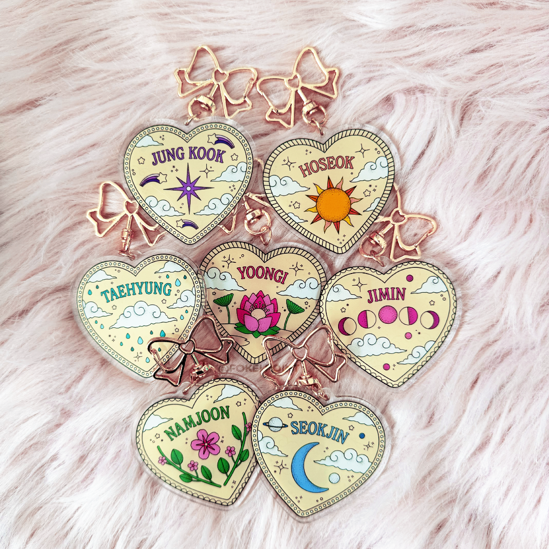
Featured cards:
Permission to Dance (on stage) - BTS
Folklore - Taylor Swift
Dynamite - BTS (from BE)
Cornelia Street - Taylor Swift (from Lover)
Happiness Begins - Jonas Brothers
The branding for an up and coming, imaginary, band called “Alchemy.” For the assignment, everything about the band was up to each individual designer: from the genre of music the band would make, to the demographic the band would cater to and the band’s logo, tour merchandise and the creative direction for their debut album. Taking inspiration from my favorite band, The 1975, I decided I wanted Alchemy to be an alternative pop/rock band with a synthpop twist that could be enjoyed by all ages, but mostly focused on the young adult demographic. The main point of this project was for the “audience” to automatically know what a song by this band would sound like just from looking at the branding.
For the logo, I decided to simplify the name Alchemy down to three simple shapes: a triangle for the A, a square for the H and a circle for the Y. But, since the concept was so simple it wasn’t specific to one genre of music over another, so I decided to glitch them slightly to add character and individuality, and to tie in the band’s genre. I paired the shapes with a vibrant color palette filled with yellows, blues and greens, to add more interest to the project itself without going overboard, by pouring acrylic paints onto a canvas board. I paired the neon colors with either a light or dark grey to really help the colors stand out on their own.